One of the big trends we are seeing in online marketing in 2018 is building a strong ‘Customer Journey Optimisation’ strategy (or CJO).
The more we de-humanise the selling process by using technology to sell our school (think the school website, email marketing, social media marketing, school promo videos etc), the more difficult it is to really nail the Customer Journey Strategy.
Why?
The human element and ability to show empathy, compassion, adjust your message and delivery as you would with face to face interaction doesn’t exist in the digital medium.
Or can it?
Before I go into the 2 proven steps to improve your CJO, let’s look at what the Customer Journey actually is.
What is the customer journey in the school enrolment context?
All families are not equal – that is the first thing we need to understand.
We all come with a different set of life experiences (positive, negative & neutral), relationships already established in the community, children with different needs, varying family circumstances, levels of insight into what a particular school does based on what we have seen or heard, the baggage of conversations we have had with other people about the schools in the area, geographical factors (where one lives) – and this list can go on.
So when it comes time for a family to start looking for a school for their child – the decision will be based on all of these factors (and no doubt many more).
The first step of the customer journey is your school website
The school website is often the first direct interaction a family will have with your school.
Granted, they may well have talked to other members of the community and done some anecdotal research (we are talking ‘word of mouth’ here) but in terms of direct interaction with your brand, the first step of their journey would most likely be jumping on the website and checking you out.
The question you need to ask yourself is “how much do they know about us when they arrive at the website for the very first time and what are they hoping to achieve by coming to your website?”
By understanding this we now have the ability to deliver a message that matches their stage in this journey.
The old saying that ‘first impressions count’ has been indoctrinated into us from birth. And there is a reason for that – it’s really difficult to ‘undo’ the first impression. It is possible – but it’s very hard and takes time.
School enrolments are a competitive market as it is, so why start on the back foot if you don’t have to?
Nearly all human beings on earth are visually and emotionally driven. We buy, socialize, make decisions and operate based on what we see and how it makes us feel.
Our first impressions are mostly visual stimulations, and those visual stimulations trigger an emotional response.
Step one: Great photos will make the first impression positive
You need to make sure that at the top of your website (the first thing they see) there is a bright, shiny photo that the audience will resonate with (see example below).
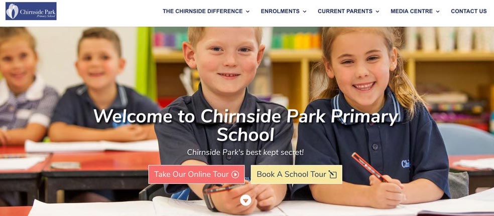
Often it’s laughing children captured perfectly in a visually attractive environment.
This will trigger a subconscious emotional response from the parent – and their first impression will be the school looks great and the kids look happy. And they will immediately be picturing their child in that context.
Imagine on the other hand if they come to your website and the first thing they see is a poor quality photograph (that looks like it was taken on an iPad by one of the teachers).
The colours are dark and the background is horrible and overall it doesn’t match the professional image that you would want to be displaying.
The first impression now is NOT positive – and will sit somewhere between neutral and negative.
Will you lose them on this first impression forever?
Maybe – it depends on your target market and their expectations. Either way, you are on the back foot already.
At the very least, fill whatever website space you have with high-quality photographs.
Hire a professional photographer to study your website and take photos that will fit into the infrastructure and gaps you already have.
Remember, you don’t have long to impress. We used to think that it took 7 seconds to make a first impression.
According to new research, it’s about 100 milliseconds! That is probably a representation of how fast our world moves now – driven mostly by technology, social media and high demand for instant gratification.
Step two – a user-friendly website experience is vital to capturing the attention of someone coming to you for the first time
Everyone is busy! We know what.
The way our world is set up means we are forced to work harder and harder just to keep up because everything is becoming more expensive and there is a lot of competition for our attention.
So many distractions often lead to overwhelm and quite often – indecision!
Knowing this information is not enough – especially when it comes to marketing and selling your school.
The very early stages of the customer journey is research. This is typically not a BUYING mindset – but a BROWSING mindset.
Have you ever purchased a new car, home or even a couch?
Let’s use the couch as an example. The first thing you probably do when you decide you want a new couch is you jump online and browse different styles, colours, fabrics, prices etc.
Before you know it, you have been through 10-20 different websites in “browsing mode”.
Can you remember a time when you were doing this research and you landed on a website that didn’t display those couches (or whatever it was) in a very user-friendly manner?
Perhaps there was no logical way of finding the information you needed that was relevant on that site. Or the site was unprofessional.
We all have these website experiences almost every day. But the question is – how long do we last on these websites?
If you are anything like me (and most other online researchers/shoppers) chances are you don’t.
You subconsciously say “too hard – doesn’t look like a professional brand…. next” – and you are on the next website quicker than you got off that one.
When you land on a site that has great pictures and great layout – and price and everything else stacks up then you shortlist… and keep browsing.
Imagine if you were the owner of the website that had people jumping off as soon as they got on.
You may have the same couches as the other stores and they may even in fact, be better – but because the online experience you offered your users was poor – you lost the customer and in effect – lost the chance of making a sale before they even saw your product.
I’m here to say that selling a school is no different.
You have to understand the psychology of the common parent. Busy, stressed, not enough time in the day and looking to make the best decision in the least amount of time possible.
Isn’t that all of us?
Quite often the school that captures the attention first, gives the most information in the most user-friendly way will win.
That’s a tragedy for those amazing schools out there who don’t invest in a great online experience.
Try laying your site out in a way that draws attention to the elements that you think matter to prospective parents.
This is an example of how our menu system looks on the websites we create:
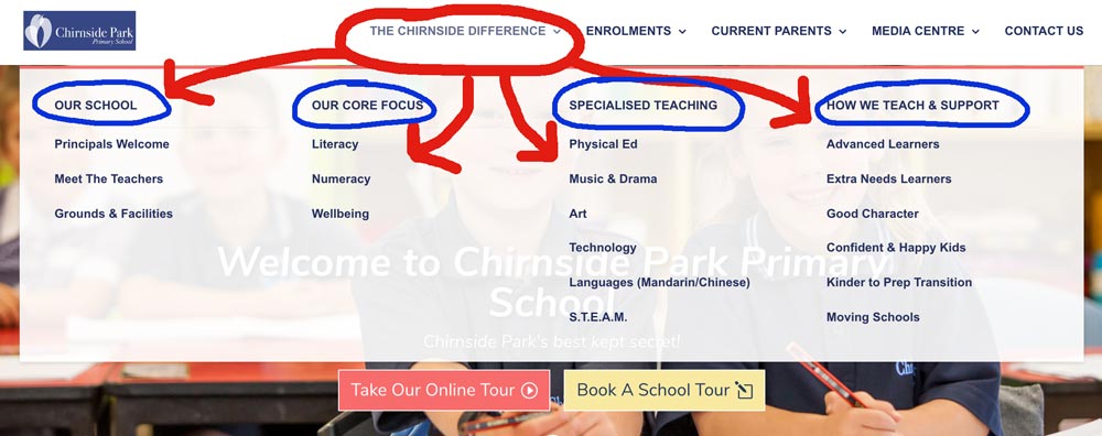
You will notice our menu categorizes the information that is most important and also draws attention to the things that we know from years of research most parents care about.
Essentially we don’t offer anything that is not important to a parent in the early stages of the “browsing for a school” journey.
Some examples of these non-important elements that pop up on most school websites I see (almost at the top) are minutes from school council, the canteen price list and scores from the district athletics!
Does that mean these things should not be on the website? Of course not.. it just means they not taking up prime real estate and could be better posititioned somewhere else
Conclusion
Designing a website that is user-friendly and captures the attention and imagination of your prospective family is a challenging task.
My advice is to always take your principal/teacher/admissions offer hat off and be the parent without a Bachelor of Education & 10 years teaching experience in the classroom. Pretend you are the typical parent and ask what is most important to me and how much information can I absorb before it’s too overwhelming.
Once you have answered that question in your own mind, write it down and get some feedback from a range of parents you do have and try to confirm if you are correct.
You can then act on re-designing your website with confidence.
A website should be seen like real estate. Different areas attract different values based on the location.
My advice is to not sell the most prominent spaces on your website to school policies, excursion reports, and a weather app telling you it’s going to be 27deg and sunny (that’s what smartphones are for!).
Keep the prominent spaces for educating your prospective parents on the things that are most important to them. You will book more tours and in doing so – your school enrolments have no other option but to grow.
About Digital Schools
Digital Schools provides tailored online education, website design, digital marketing and engagement strategies for primary schools throughout Australia. For more information, please reach out to our friendly team.
Recent Comments